Last week I was in Charleston teaching a Landscape Workshop at the Artists' Loft School; here are some of the images by my workshop students highlighting the lessons....
We spent the first day working on selecting subject matter. The students brought in their photos of the landscape, and we discussed editing these reference photos, choosing a focal area, and crafting a composition where all the elements support and lead to the focal area.
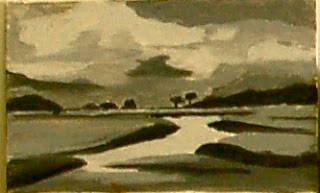
Much of the day was spent exploring the concept of "value" or the light and dark of a painting, and we did several value exercises, including a mostly "light-value" (High Key) painting, and a "dark-value" (Low Key) painting; both exercises painted in black and white plus two shades of grey:.
Student painting exercise: dark-valued painting, 4 values
When the students were satisfied with their composition and value painting, we worked on toning the canvas, or paper, and "wiped out" the image, making sure we kept the values, or tones, consistent with our sketches; after this stage, the student was ready to paint. This is one way of getting the values right in your painting:
Student underpainting
Day Two was focused on Color with students working on various color scheme exercises, such as Complementary, or contrasting color, Analogous, Neutral with one bright color, and the concept of Color Temperature in painting.
I think the easiest way to think about the concept of "warm" and "cool" color is that (1) the temperature of a color is relative to whatever color is around it, and (2) warm colors generally have more yellow, cool colors more blue.
Here is a student's work of a warm and cool version of the same image:
Student work, Warm and Cool
We worked a lot with the color wheel and the concept of complimentary color, or those colors opposite on the color wheel. One of the students, Alice, was using pastel, and here is her Complimentary Color scheme exercise; she painted a toned background in a hot pink color in the first image, then a blue background in the second:
Student work by Alice, Complimentary Color Scheme
Another student, Barry, also worked with a complimentary color scheme; he painted the background color orange in his first image, then a cooler raspberry color for the second, using a lot of the complement, blue, on top of the orange, for a vibrant contrast.
Student work by Barry, Complimentary Color Scheme
Some of the students worked on the following exercise: the students painted a mostly warm painting, using cooler color in the focal area and in the trail to the focal area.
Student work by Christy, warm painting with cooler focal area
Another piece by Christy, using mostly cool color, with highlights and focal area in warmer color:
Student work by Christy, mostly cool with warm highlights
Another student's work in mostly cool colors, with highlights and focal area in warmer color:
Student work in mostly cool colors with warm focal area
Here is a piece by Paula, whose color scheme was a more neutral, greyed one, using mostly neutral colors, and one bright color, using the background toned color as an accent:
Student work by Paula, neutral plus one bright color scheme


